Tommy T Cyclery
Minneapolis to biking is like peanut butter to jelly; they just go together. ︎︎
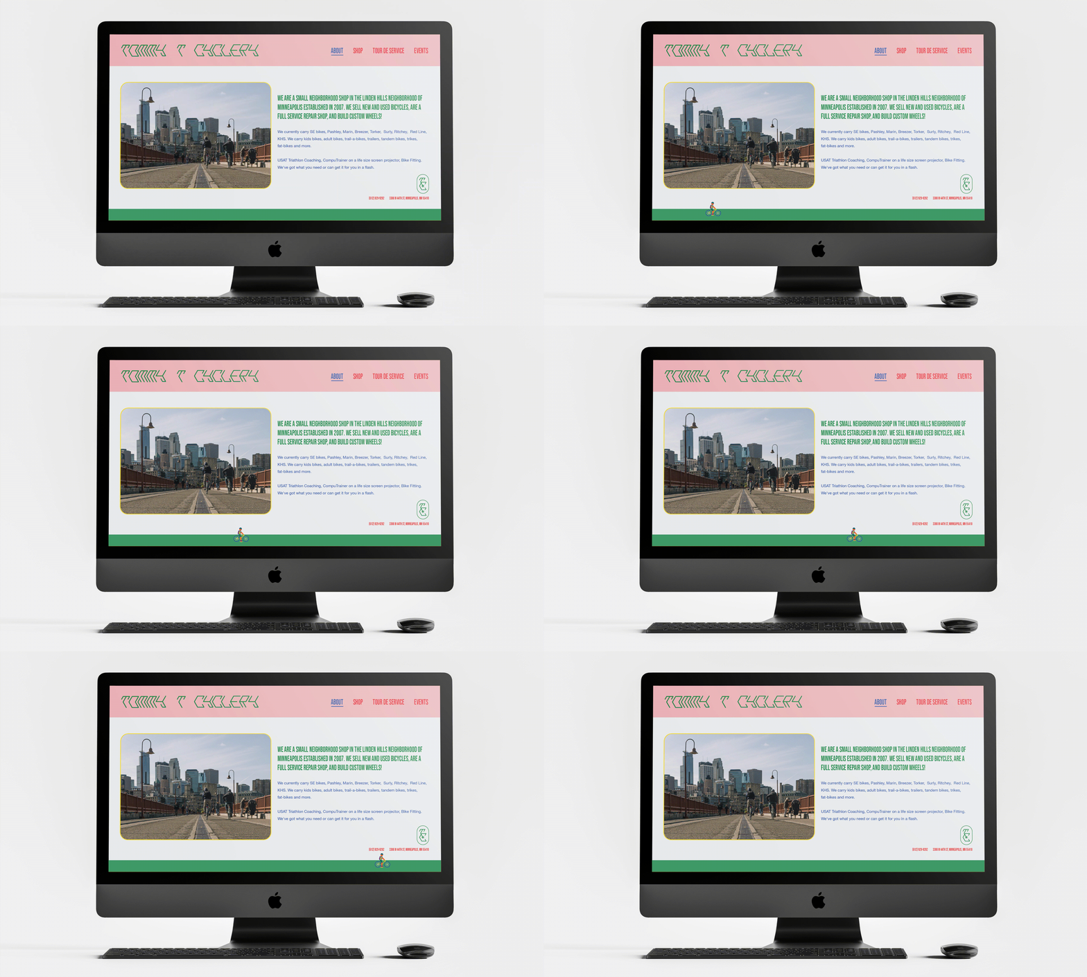
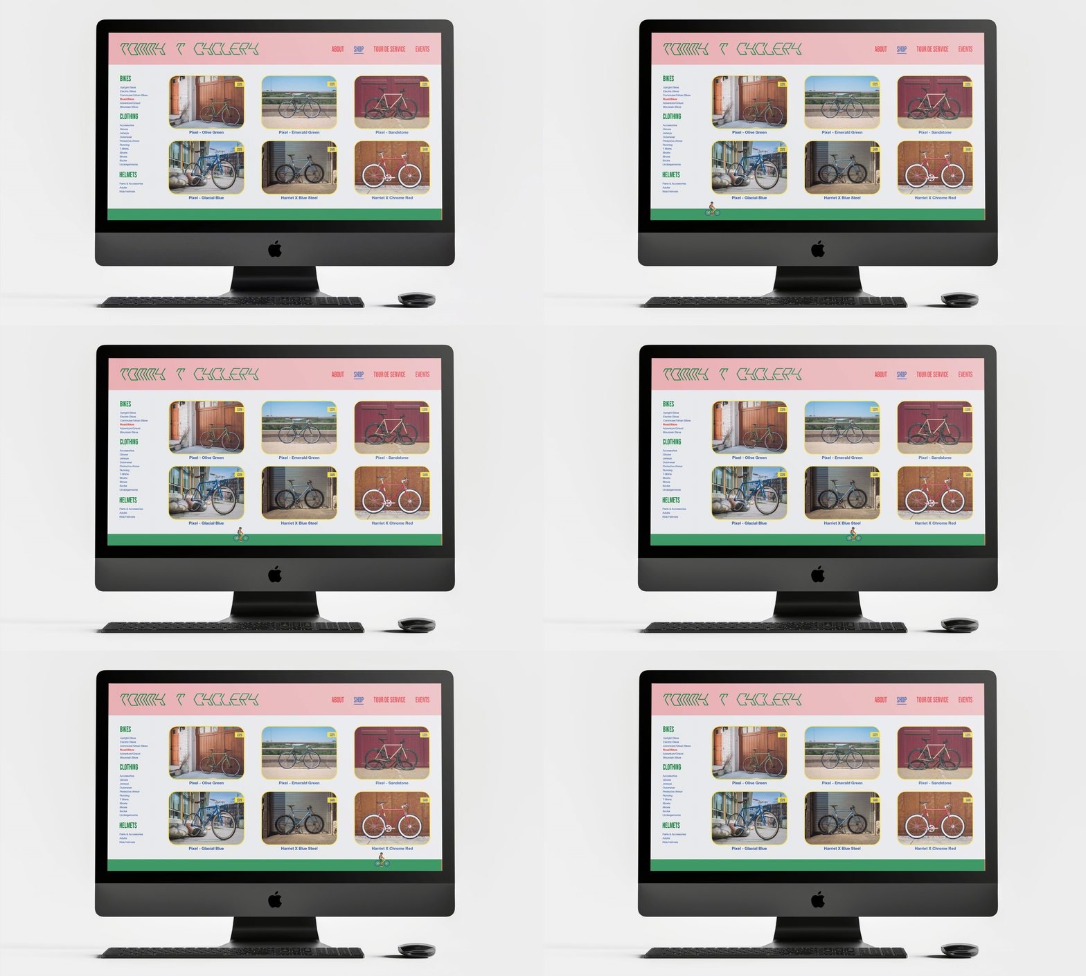
I redefined Tommy T Cyclery’s visual system to create an identity that was more inclusive and unique to the area they serve. Tucked between four of the major lakes in the Minneapolis area Tommy T Cyclery strives to bring their customers greater access to biking with a classic midwest smile.
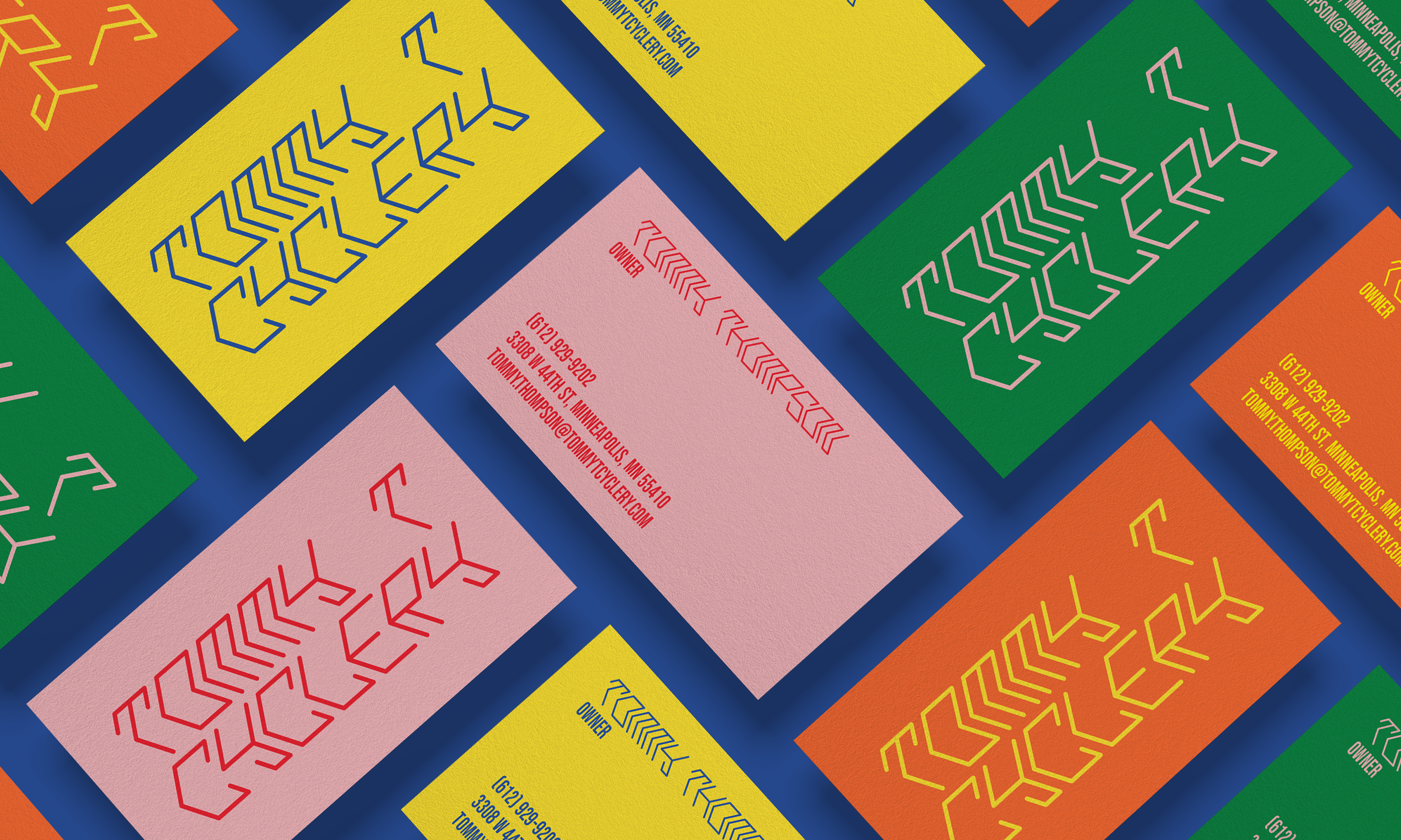
Typeface: Hex; the typeface that takes you for a ride. I created this typeface inspired by the humble hexagon. When stacked, Hex resembles the tread of a bike tire. This unique typeface combines mechanics with movement–– letters fit together seamlessly, forming dynamic words that travel across the page.
Color Palette: Blue, yellow, orange, green, pink and red are as vibrant as the neighborhood in which Tommy T Cyclery resides. Rainbows are a symbol of inclusivity and Tommy T Cyclery promotes just that, biking for all levels of experience.


